Tuesday, June 3, 2014

Shared Girls Room and A Kid's Desk

Hi guys! I'm sharing a quick "before +after"/new product post with y'all today!

We have two little girls, 2 and 3 years old. I LOVE being a mom to girls. I love the pink, the ruffles, the dance class, even the drama that already daily ensues at our house. I feel like I was just made to raise girls. That being said, when I was gathering inspiration for their shared room redo, I knew I wanted to stay girly, but not TOO girly, if that makes sense. Here are some pictures I used for inspiration!


I loved the white/light walls with splashes of color from textiles and furniture in these rooms. I tried to stay within a light pink/orange/grey/ white pallet, but that was the only parameters I really followed.  Let's look back at the room the day we moved in...


Beige. Everywhere. Delightful shelves that made our eight foot ceiling feel even shorter. Half shutters on the windows. Why would we change a thing? Ha! The room was first re-done in a pink/black/white for the nursery of girl number one. No pictures of that one, sadly! When number two came along a year later, this room became a little more "big girl." 


A little better, yes? The girls are now at an age where sharing a room is SO fun for them. We also freed up a bedroom to use a guest room for the two times a year we have guests :).  


Do you spot the cute little kid's desk? We needed a wide table to fill the space between the beds, and when I found these PERFECT kid's chairs on Overstock, I knew they needed a desk! I went to the hubs and he came up with this perfect piece for the space! I finished the desk to match the floating shelves we built a while ago for the room. 


I hope you enjoyed the before + after! As with every space in our house, I'm positive it will evolve again, but I am loving it right now! I'll be back with a bathroom vanity post SOON! 


be blessed,

leslie 


Monday, February 10, 2014

Supper Club Tablescape

Hi friends! So, it has been forever. With the combination of the holiday season, and just feeling in a blogging slump the past few months, I have been absent for awhile! Its a goal to be more consistent at this blogging thing :).  White House Tables has been BUSY, and we have our wonderful customers to thank for that. We are so grateful to all of you who invite us to help furnish your home! Before Christmas, we were able to build a few NEW pieces that I am so excited to share with you all.


But first, our first annual Supper Club was this past Friday night. We had SO much fun hosting sweet friends and watching the opening ceremonies for the Olympics. I put together a table of black, white, and gold, with a pop of coral. Its fun to show you how glamourous one of our farmhouse table can look!


The kraft paper bags were filled with demi baguettes right before dinner was served. An idea taken from Pinterest :). 


The chargers are actually melamine serving platters from Target. They were on sale last week when I picked these up. The dinner plates are from IKEA, and I have used them in so many ways. The b and w pattern is super versatile. The gold ware was my sister's that I stole :) (thanks, Jenn). The kraft paper bags are Hobby Lobby in the gift wrap section. The flowers are from our local grocery store, HEB. 


See how fancy a farmhouse table can be? One of my favorite things in life is setting a great table for dinner with friends. It's the little things, right? Stay tuned for a post detailing our newest pieces at The White House Table Co.!

be blessed,

leslie 


Tuesday, November 12, 2013

The Adams: NEW table design

Good morning, friends! So excited to introduce you to our newest table design at The White House Table Co! Now that we have a few table designs to choose from, we decided to start giving them names. This baby is called The Adams. 


The White House Table Co.


The White House Table Co.

This design is a little "thicker" than our previous versions. We used all 4x4 pieces of wood, which brings a heavier feel to the whole base. I LOVE the look of it! 

The White House Table Co.

We also chose to make a slightly different top. Instead of our traditionally symmetrical planked top, we used a mixture of widths for our planks, creating a more "hey we just used the wood we had in our barn" look. we also put a 2 x 8 piece running horizontally across the ends to change things up a bit more. 

The White House Table Co.


The White House Table Co.


The White House Table Co.

And, of course I couldn't resist a few "styled" pictures for y'all :).

The White House Table Co.


The White House Table Co.


The White House Table Co.

Seriously, the pictures do NOT do this table justice. If you would like to see one in person, let me know! You can find our email under the contact tab. 

Also, remember to some see us at The Holiday Shopping Extravaganza on Thursday November 21! 


Hope to see all of you there! Have a fantastic day! 

be blessed,

leslie 


Wednesday, November 6, 2013

The Makeover: IKEA Billy bookcases

Y'all. Sorry for the silence lately! We have been super busy with life and tables this past week! Thanks to all of YOU for the table busyness :).  I bought these functional but boring IKEA Billy Bookcases this past July for our bedroom. 


We bought two in the 79.5 " height. I bought them with every intention of sprucing them up to make them more like these…


In true fashion for my projects, it took a few months for my vision to become reality. But, good things come to those who wait! I shared this picture on Instagram this weekend. 

The White House Table Co.

And here it is styled in our bedroom!


The White House Table Co.

I am going for a black/white/wood/gold accents feel in our bedroom, and these shelves are a perfect place to add some fun accessories and much needed storage space.

The White House Table Co. 

The White House Table Co.

To style them for these pictures, I just "shopped my house" for things that I already have and love. Now, I get to see them everyday! I'm excited to get some Christmas sparkle on them in a few weeks. Yes, I said a FEW WEEKS. Geeze. 

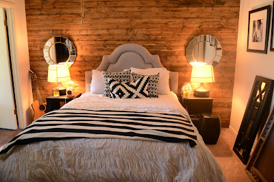
Here is a view of the bed on the other side of the room. We installed the wood wall last year, and I'm STILL loving it! Adds some great interest to the space.

 Yeah, still need to hang that mirror...

The White House Table Co.

Also sorry for the poor quality pictures! I'm still learning how to use my big girl camera, and our room is somewhat lacking in the natural light department :). I hope you love our new bookcases as much as I do! I'll be back later this week with picture of our NEW table and bench design we just finished for a client! 

be blessed,

leslie 


Tuesday, October 22, 2013

Before and After : The Office

Happy Tuesday sweet readers! Sharing another before and after from our renovation adventures here at the Whitehead Casa today. When we first moved in, the space right off our kitchen was thought of as the breakfast nook. We set up a little bench in there and called it good, thinking we might eat around the small table at some point.  But, we NEVER used that room. It was simply a pass through from the kitchen to the garage that hoarded a lot of clutter. 


"Breakfast Nook" from the day we moved in 


view into the breakfast nook from playroom

I dont have a picture of this room after we put our bench in it, sad to say. But, after living in our home about a year, I began thinking of making it in to a home office. I have shown you guys this picture before, but it inspired me to request my first Clay Whitehead piece :). 


So, using this space as inspiration, I had Clay build me this desk...


The White House Table Co.
Pretty close to the original, huh? The price tag was MUCH lower, too :). I also painted the room this awesome blue. I loved it! Its called "Loyal Blue" from Sherwin Williams. However, the previous owners of our house had done an odd thing in here. There was the thickest texture OVER the original paneling I had even seen. Painting it was a nightmare because it was so thick. But, I thought I could live with it. 

One day last June, while Clay was on his annual guys golf trip, I did this...

The White House Table Co.

Ripped that paneling right off the wall. Sort of. It was one of those projects when I realized how very little I can do without the band of helpers, aka Clay and his parents, I normally have with projects like this. I'm normally the one with the vision, not the muscles! So, I got about 1/3rd of it down before Clay came home. He was SO happy to be greeted by another project :).

We replaced the old paneling with...new paneling. But, we turned it horizontally so it gave the appearance of "planked walls."  After it was up, I began painting it a crisp white. Here is what happened after the first coat. 


It didn't stick. At. all. But, after a few coats of some bonding primer my mother in law had on hand, plus the paint with primer coats I added next, it finally "stuck."  It was not fun. 

Here is the space today: 


The White House Table Co.

It still has a bit of improvement to be made in the curtain/wall decor department, but I love how it feels so far! I am actually sitting at that desk right now writing this blog post :). We (I) use this space so much more now, and I love that I have a little room to call "mine." I hope you like it too!

Big announcement, The White House Table Co. will be at the 


We would love for all of you to come an support this great event! We will have some oversized chalkboards like the one pictured in our office, as well as kids tables and much more! You will also be able to look at our "catalogue" and place custom orders on the spot! I'll do a more detailed post soon, but just thought you might want to put it on your calendars :) 

be blessed,

leslie 


Friday, October 18, 2013

White House Wednesday...on Friday
So... we're only two days late with this post. It could be worse.  This week just got away from me! But, I wanted to definitely share some of the inspiration happening here at the WHTC.  

I have had a thing for natural/weathered/raw wood finishes since...I asked Clay to build me our first table, I suppose. If you follow me on Pinterest, you can see an emerging theme of, well, wood everything! I think it brings such warmth and depth to spaces, especially those with neutral colors (whites, grays, creams) which I'm drawn to. 

That being said, we made our first bed a few weeks ago! The hunt for wood headboard/bed inspiration led me wanting to design about 100 more. Here are a few of my favorites. 


source

source
You can always count on Pottery Barn to nail the farmhouse style. I would LOVE to have a farmhouse bed with posters like the one above. If only our ceilings were a little taller, and the bed wouldn't literally touch the ceiling :). 


source
This design was one we considered for the bed we made for a "BIG" boy room. It could go with so many themes, from nautical to vintage to sports. And, let's discuss how GREAT built in storage is? 


via Pinterest
This was the design I showed to Clay and said, "Can you make this?" This dialogue happens daily (almost).  I could get on board to having a bed like this, for. sure.
source
This design is sold at one of my favorite online stores/ design sites. I seriously love everything they sell and design. I wish we lived a teensy bit closer and their prices were a teensy bit lower :). 


The White House Table Co.


Here is a sneak peek of the bed WE made! I'm hoping to get a whole room design post once his BIG BOY room is finished. It turned out so fun, and definitely opened some new possibilities for WHTC! 

Which bed is YOUR favorite? Hope y'all have the happiest of weekends! 

be blessed,

leslie